
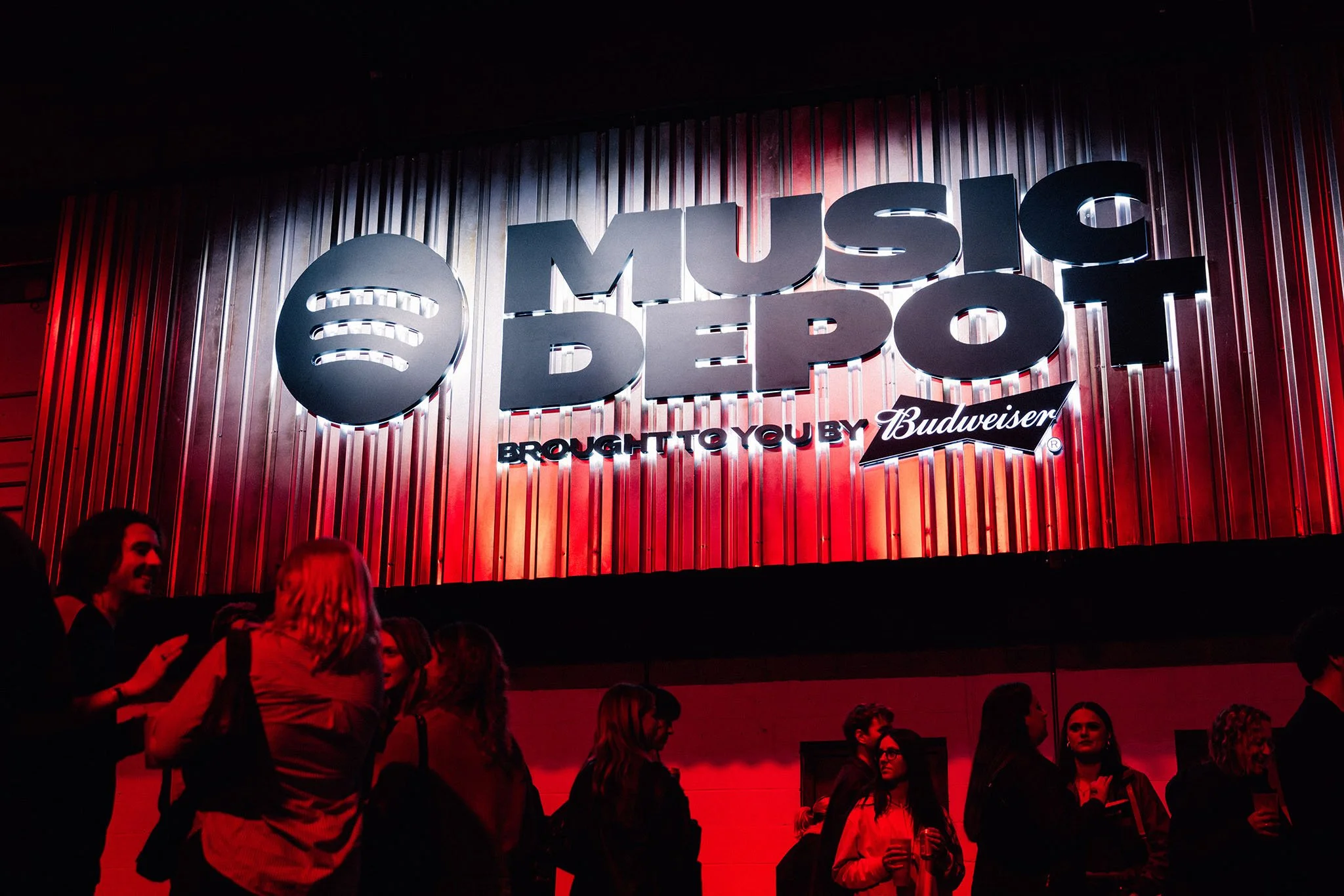
Translating Manchester’s underground music culture into a large-scale live identity system
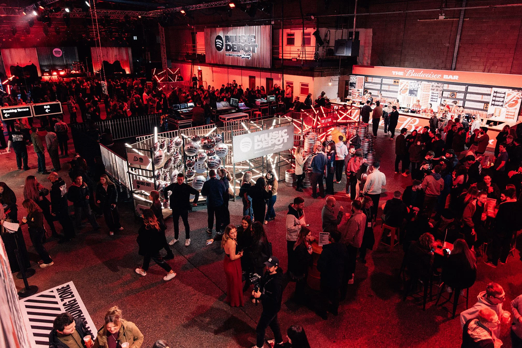
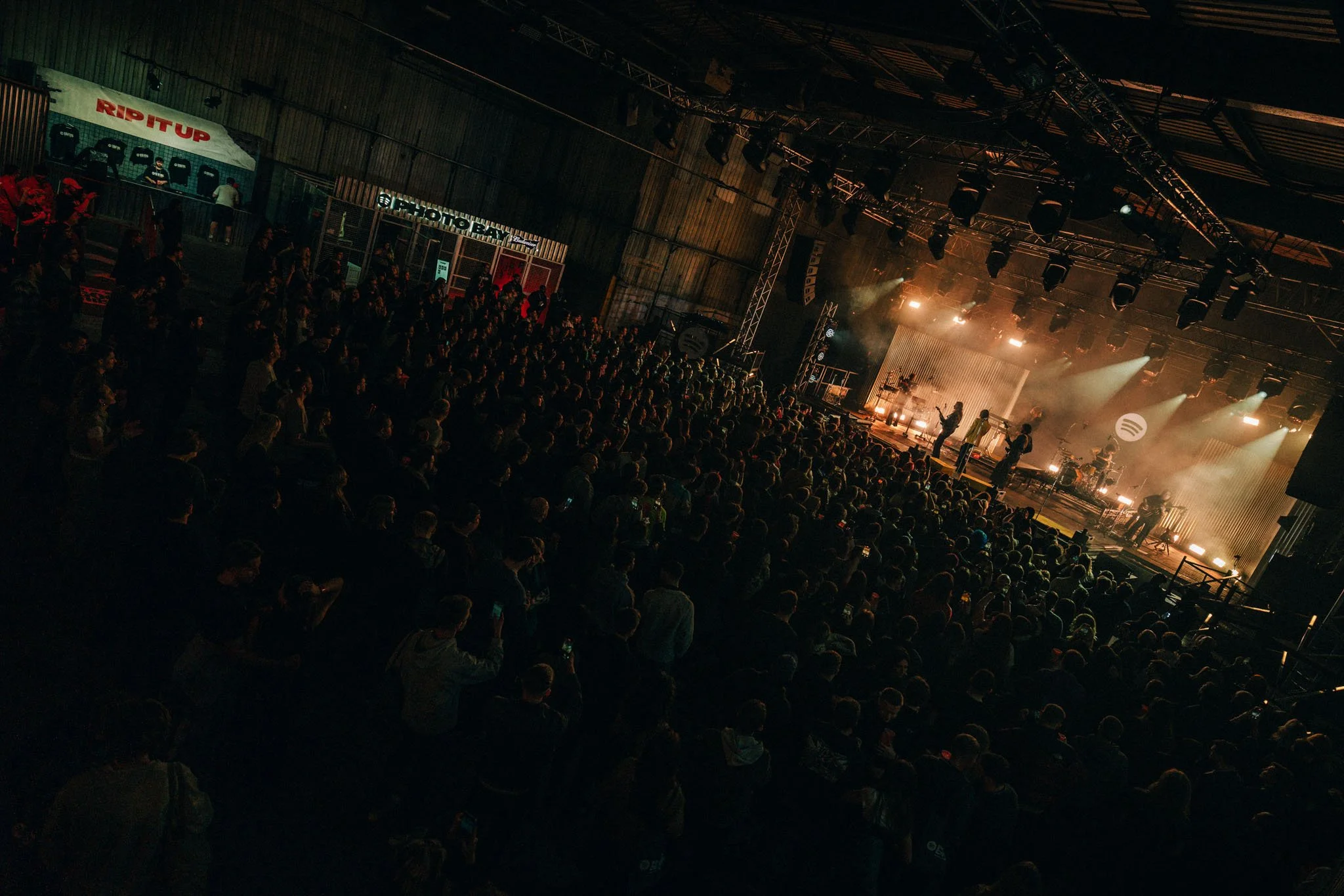
Spotify and Budweiser partnered to create Music Depot — the UK launch of Spotify’s AUX Live Experiences, hosted at Diecast Manchester, a former metalworks factory, and designed to connect Budweiser with contemporary music culture.
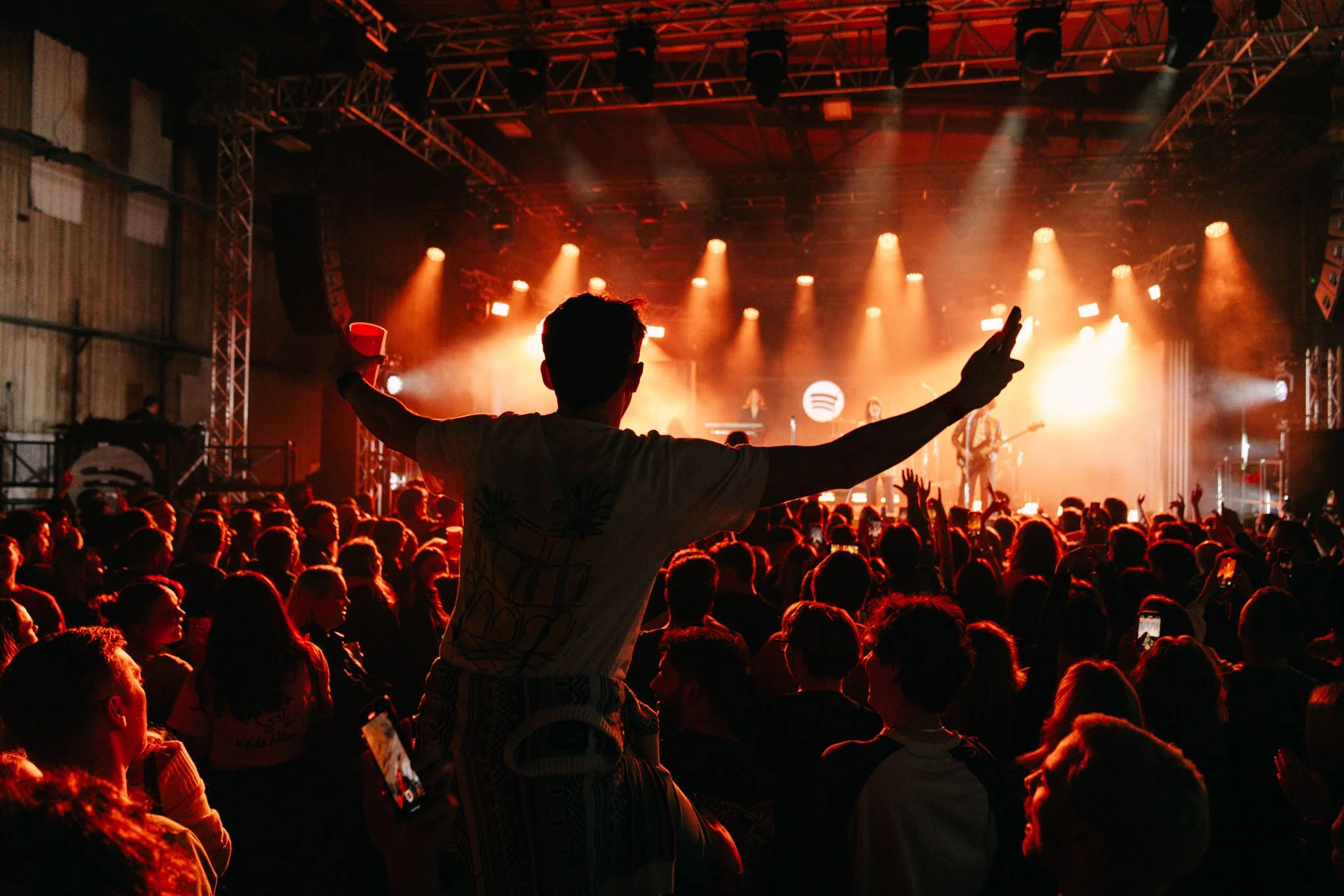
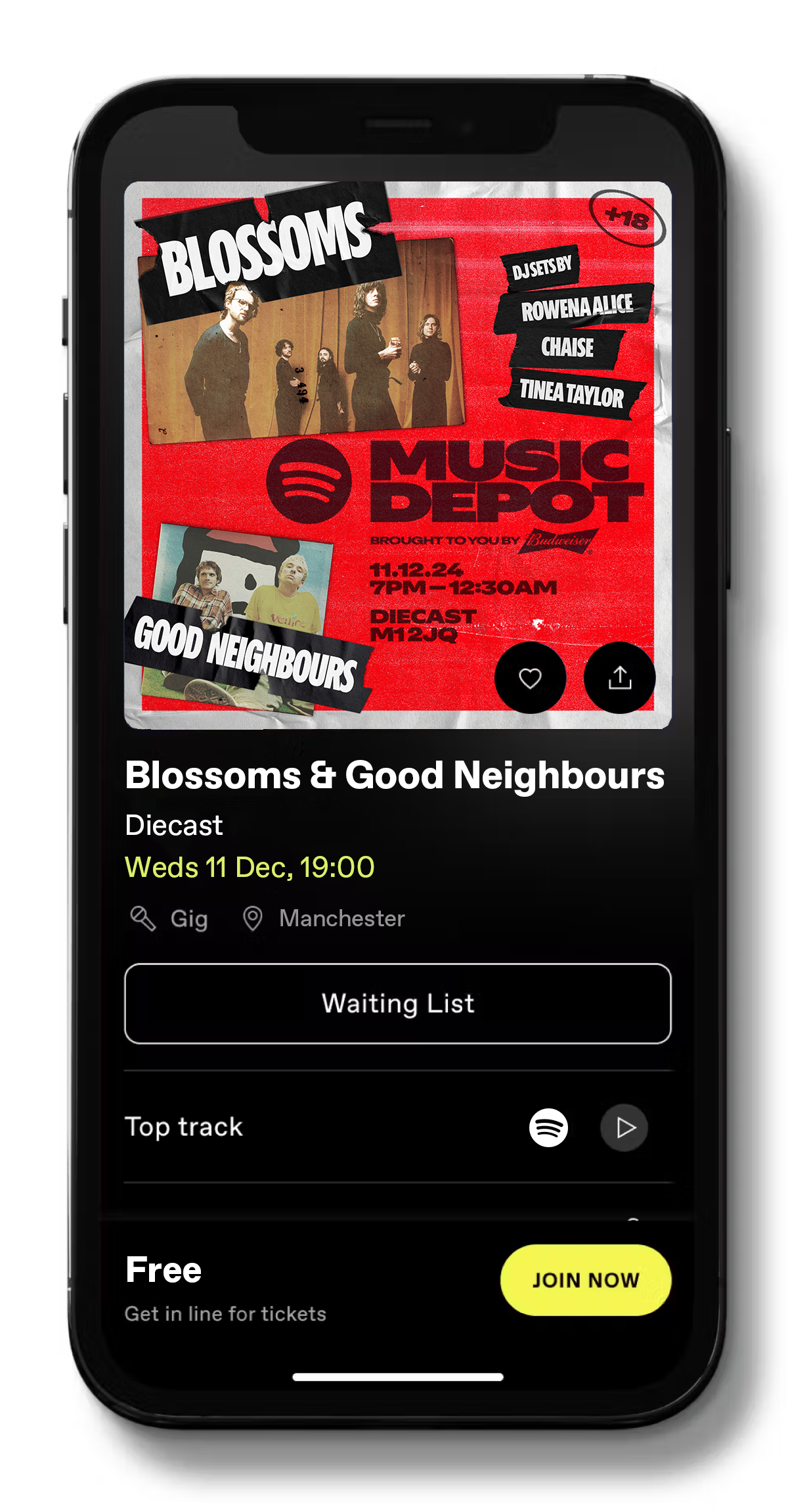
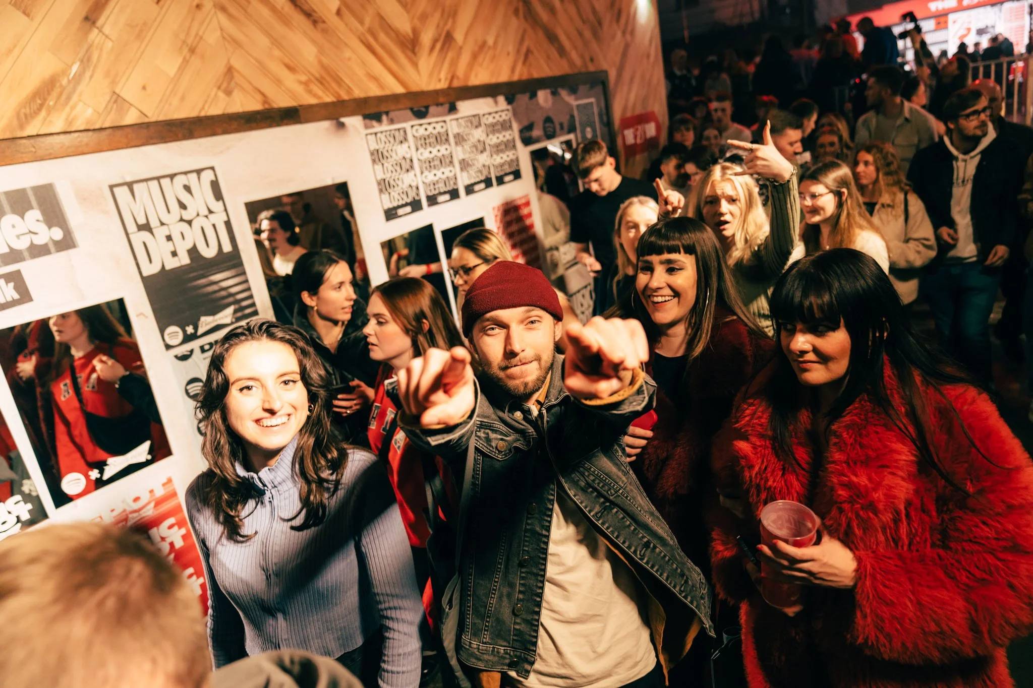
The event brought together more than 500 fans for a live programme headlined by Blossoms, creating a branded live experience rooted in the city’s musical heritage.
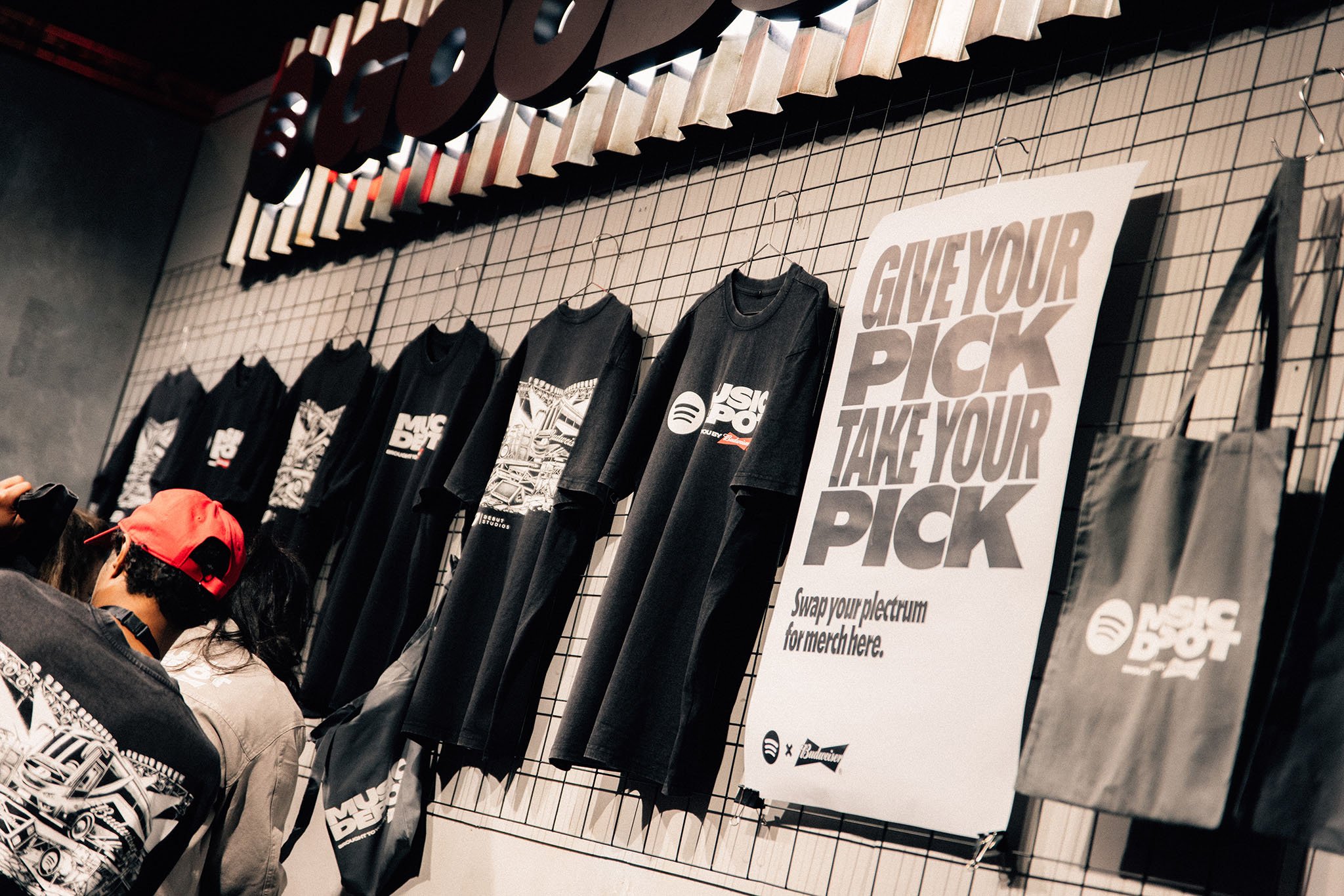
Working closely with Spotify’s experiential team, Major Keys led the graphic identity development and rollout for a live environment spanning venue graphics, merchandise, signage, digital assets, and audience touchpoints.
Client
Spotify and Budweiser
Scope
Design direction
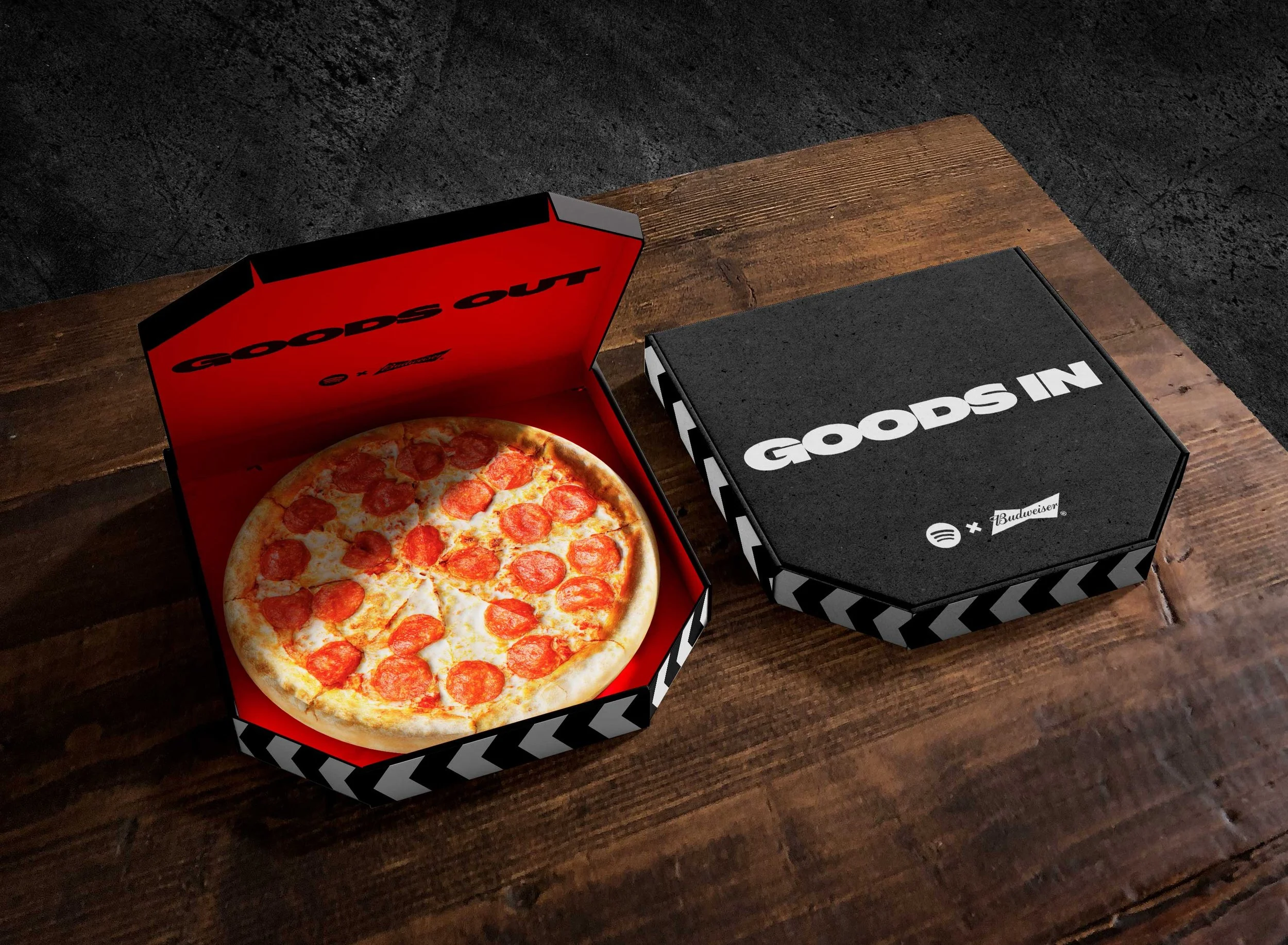
Event identity system
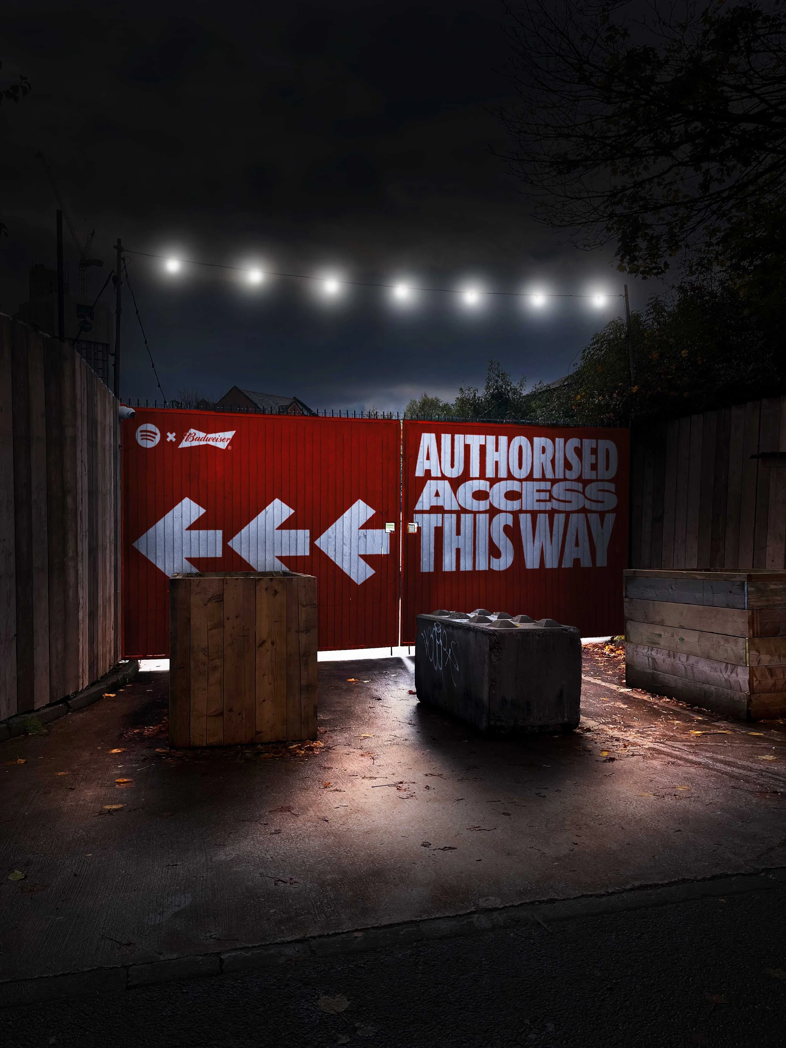
Environmental graphics rollout
The complexity
The challenge was not simply designing event graphics, but creating a coherent identity system inspired by Manchester’s underground music culture — one capable of blending Spotify’s visual language with Budweiser’s iconic branding without diluting either identity.
The system
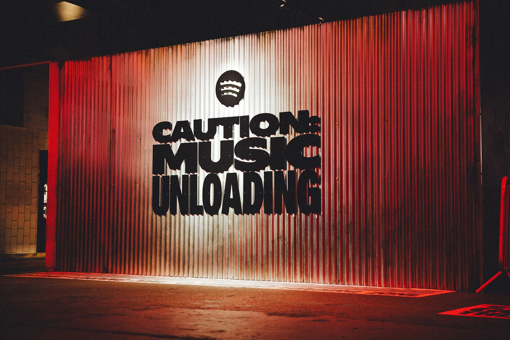
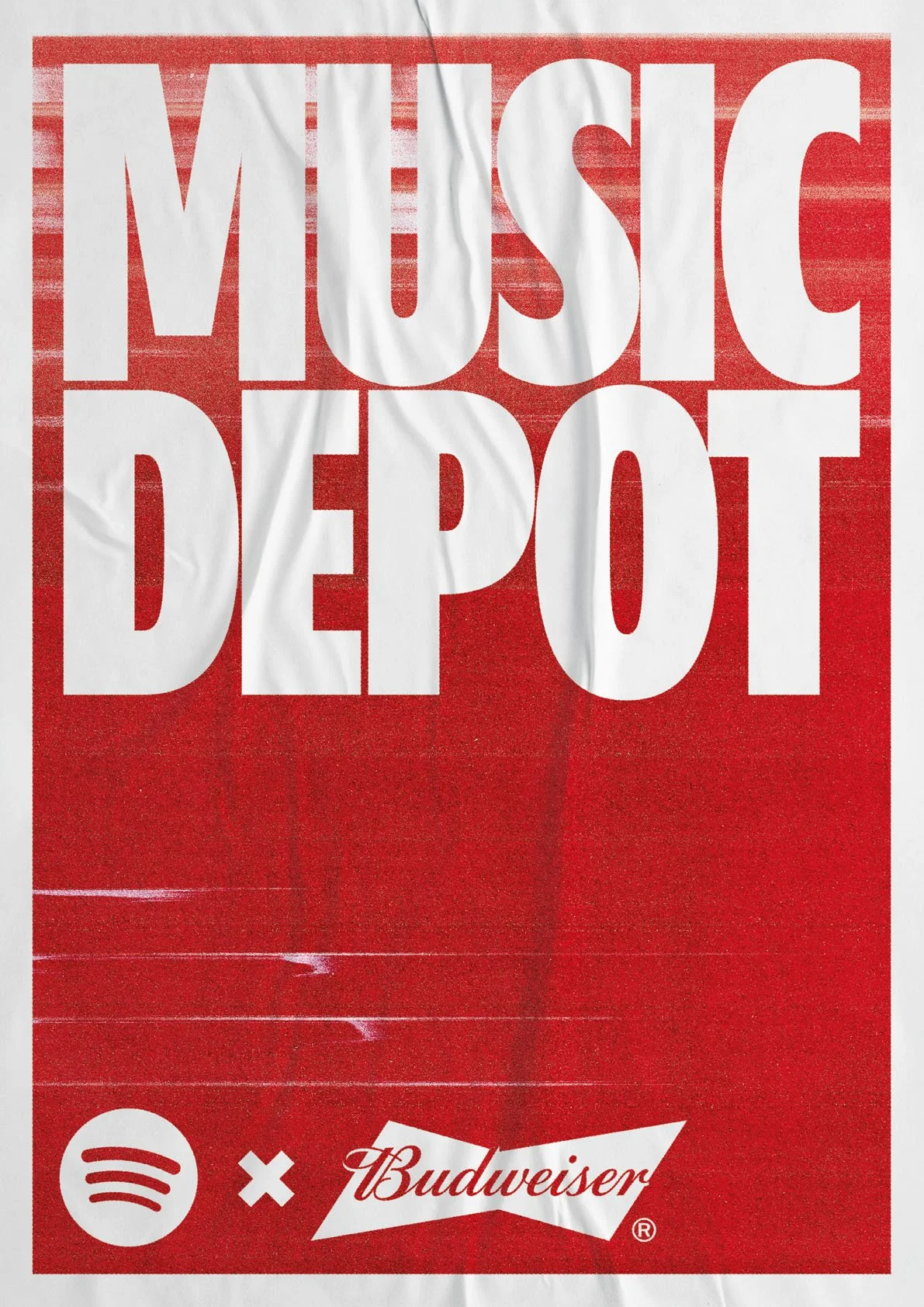
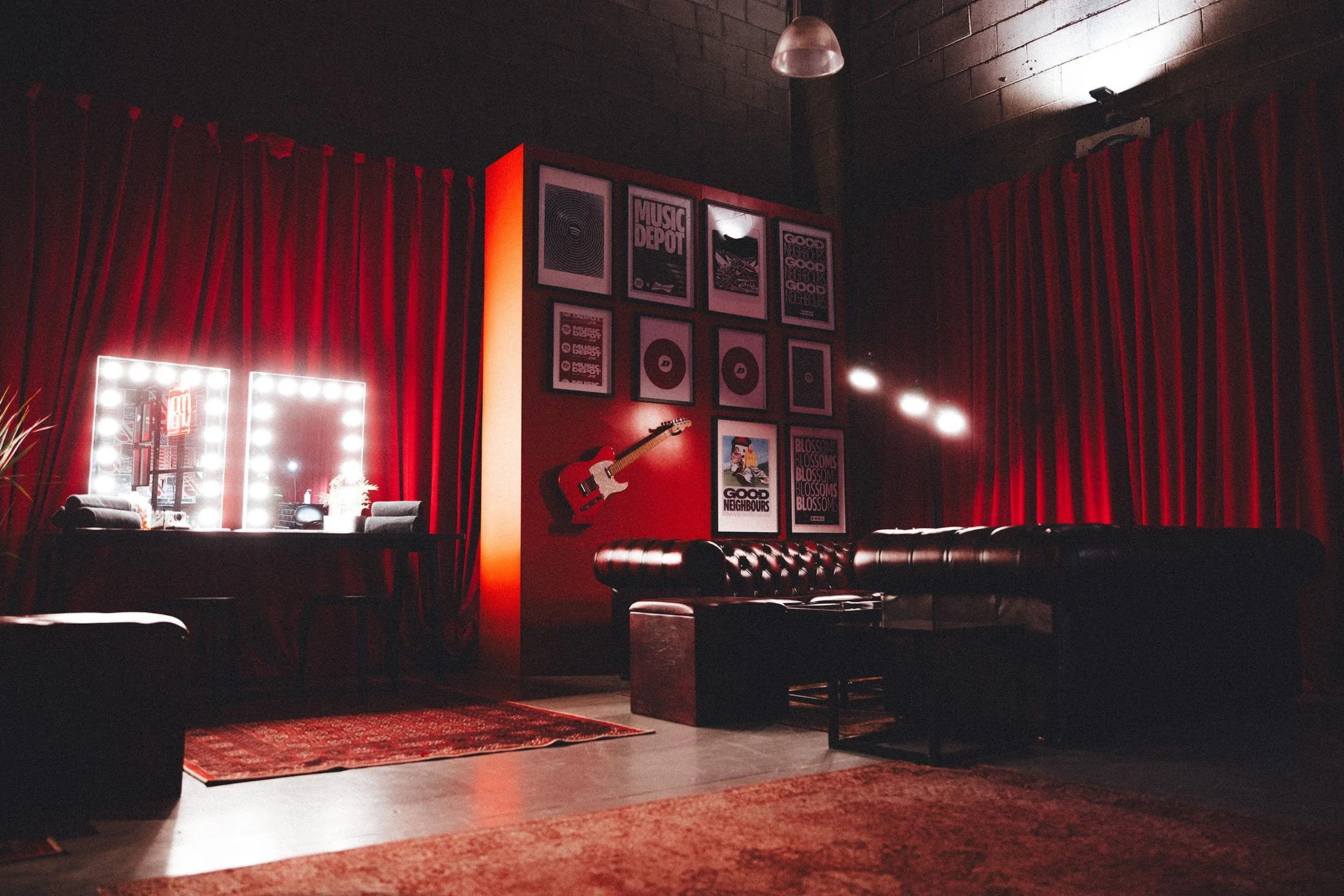
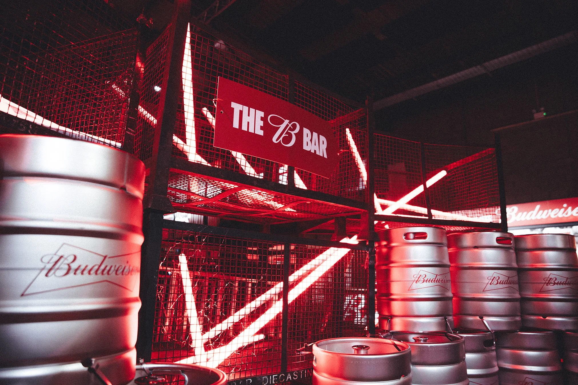
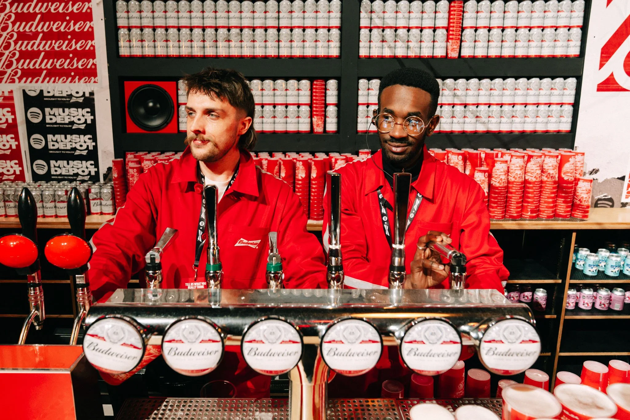
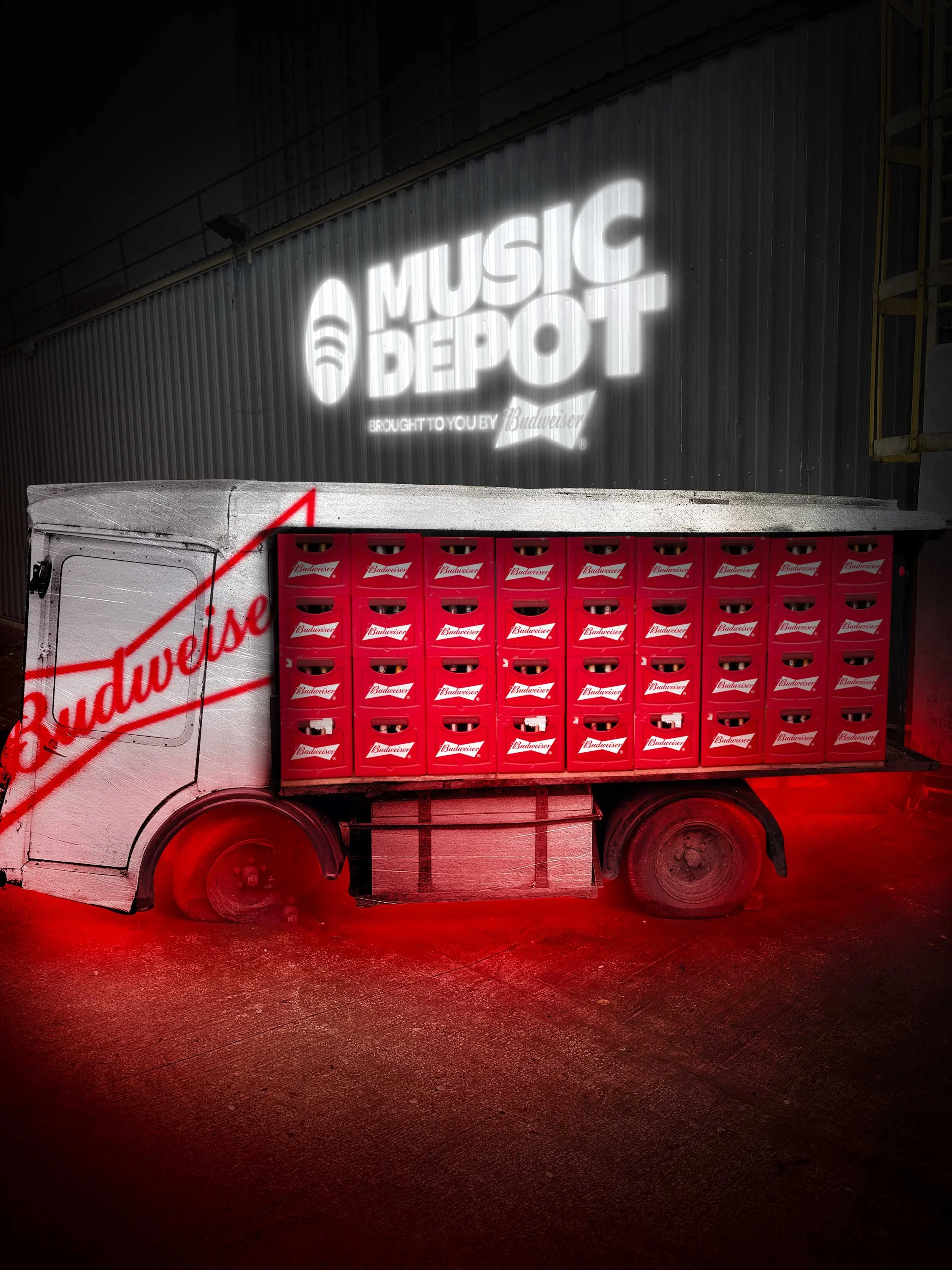
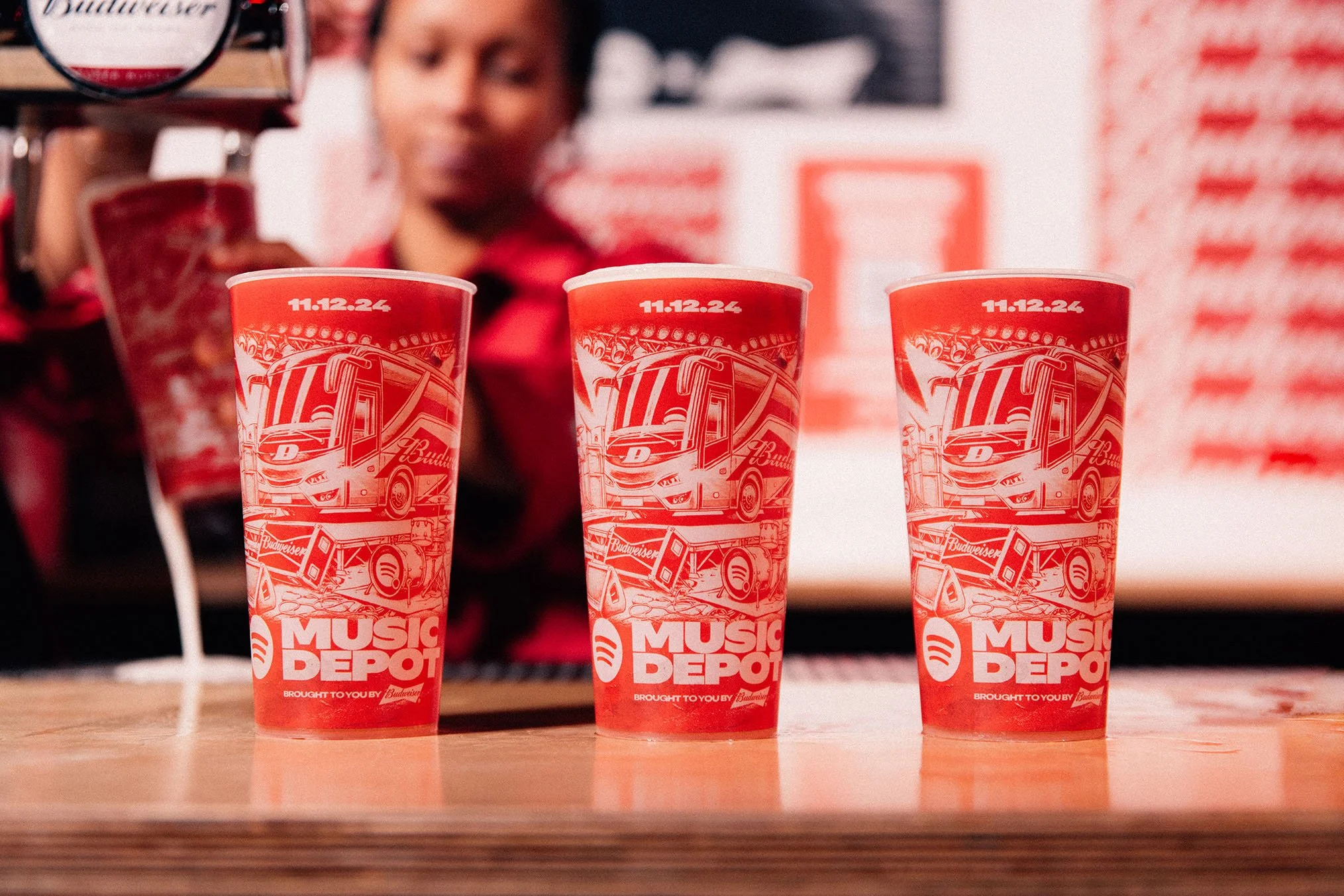
Major Keys developed a graphic identity rooted in Manchester’s industrial and musical heritage, combining warehouse textures, fly-posting, distressed typography, high-contrast layouts, and Budweiser’s unmistakable red palette. The system was designed to flex across environmental, digital, merchandise, signage, and audience touchpoints.
The outcome
The final identity created a cohesive live environment for Music Depot, balancing cultural atmosphere, sponsor visibility, and operational clarity across performance, audience experience, and venue touchpoints.
Cultural grounding
The creative approach began with Diecast Manchester itself — a former metalworks factory that connected naturally with Budweiser’s industrial visual codes, Manchester’s post-industrial landscape and the city’s music heritage.
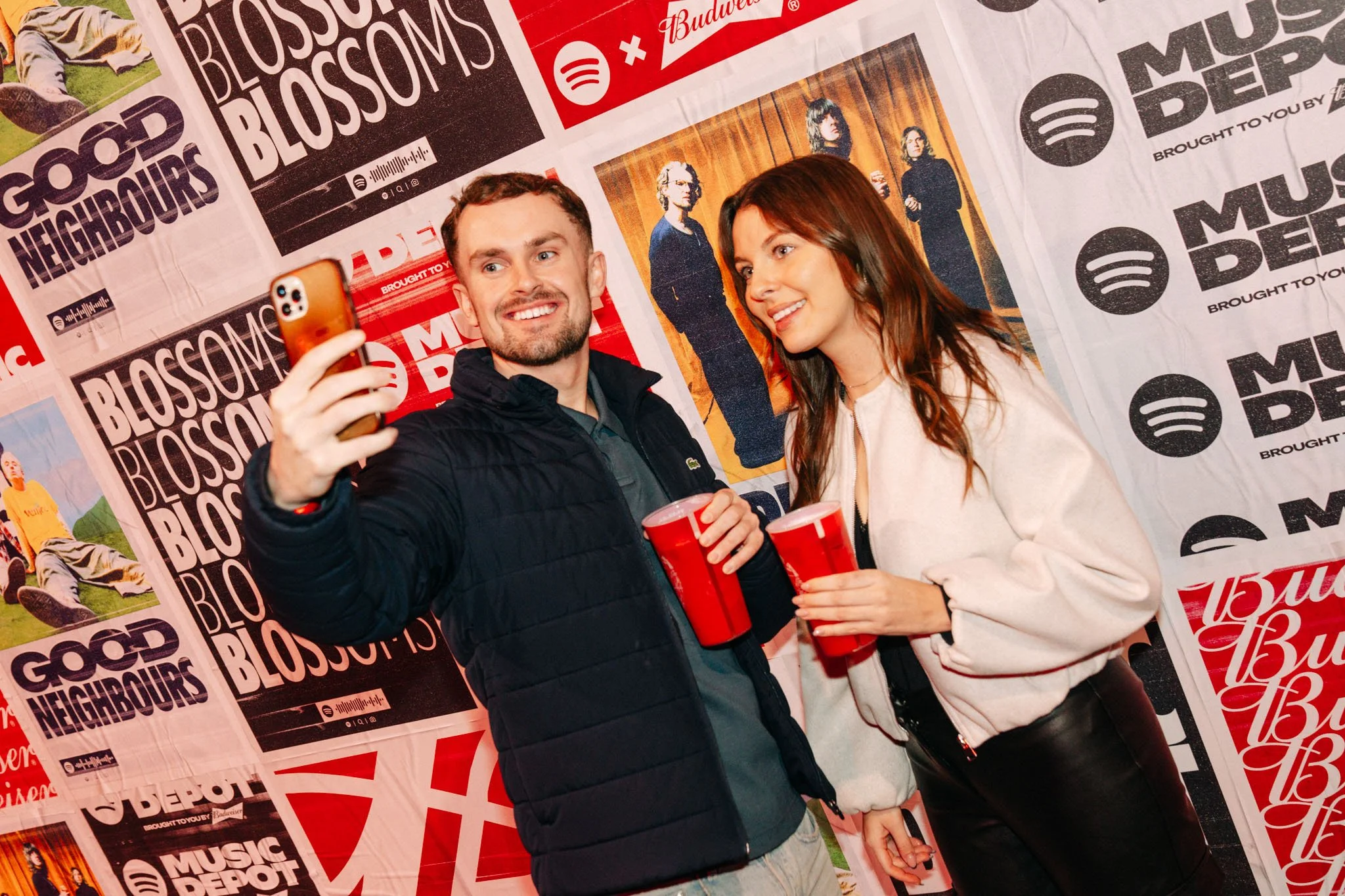
From there, the identity drew on the visual culture surrounding Manchester’s 1980s post-punk scene, including Factory Records and The Haçienda, combining industrial typography, distressed textures, fly-posting aesthetics, and Budweiser’s red palette to create a visual language that felt culturally grounded rather than superficially branded.

From visual system to live environment
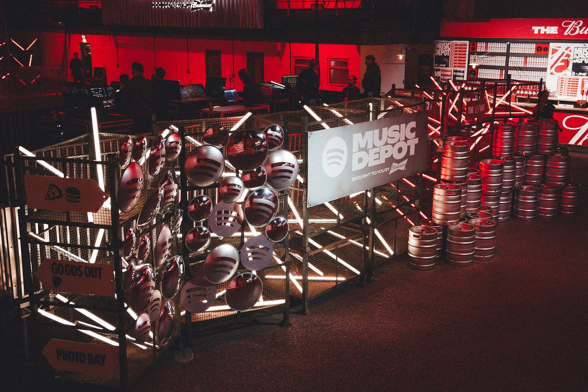
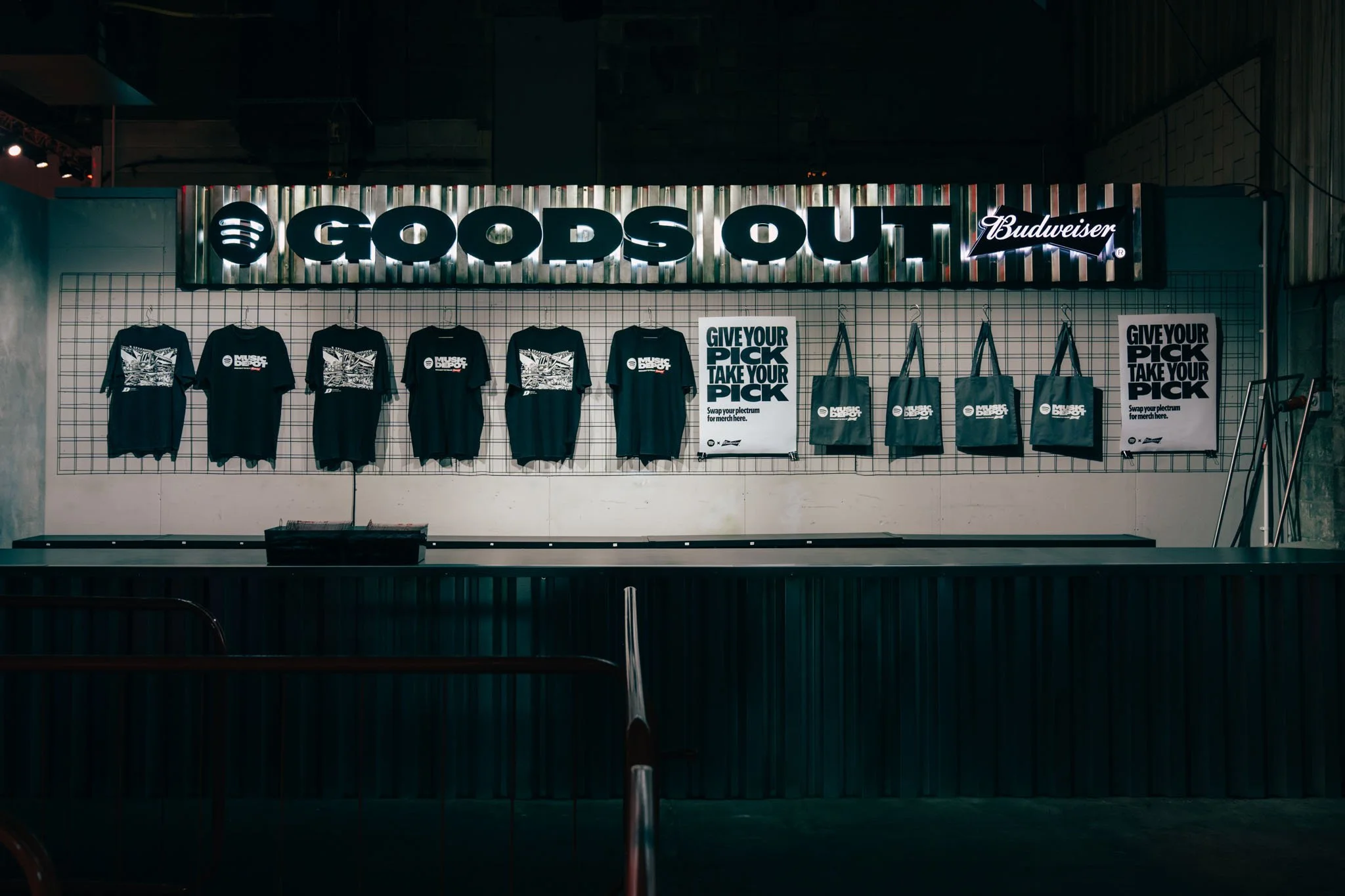
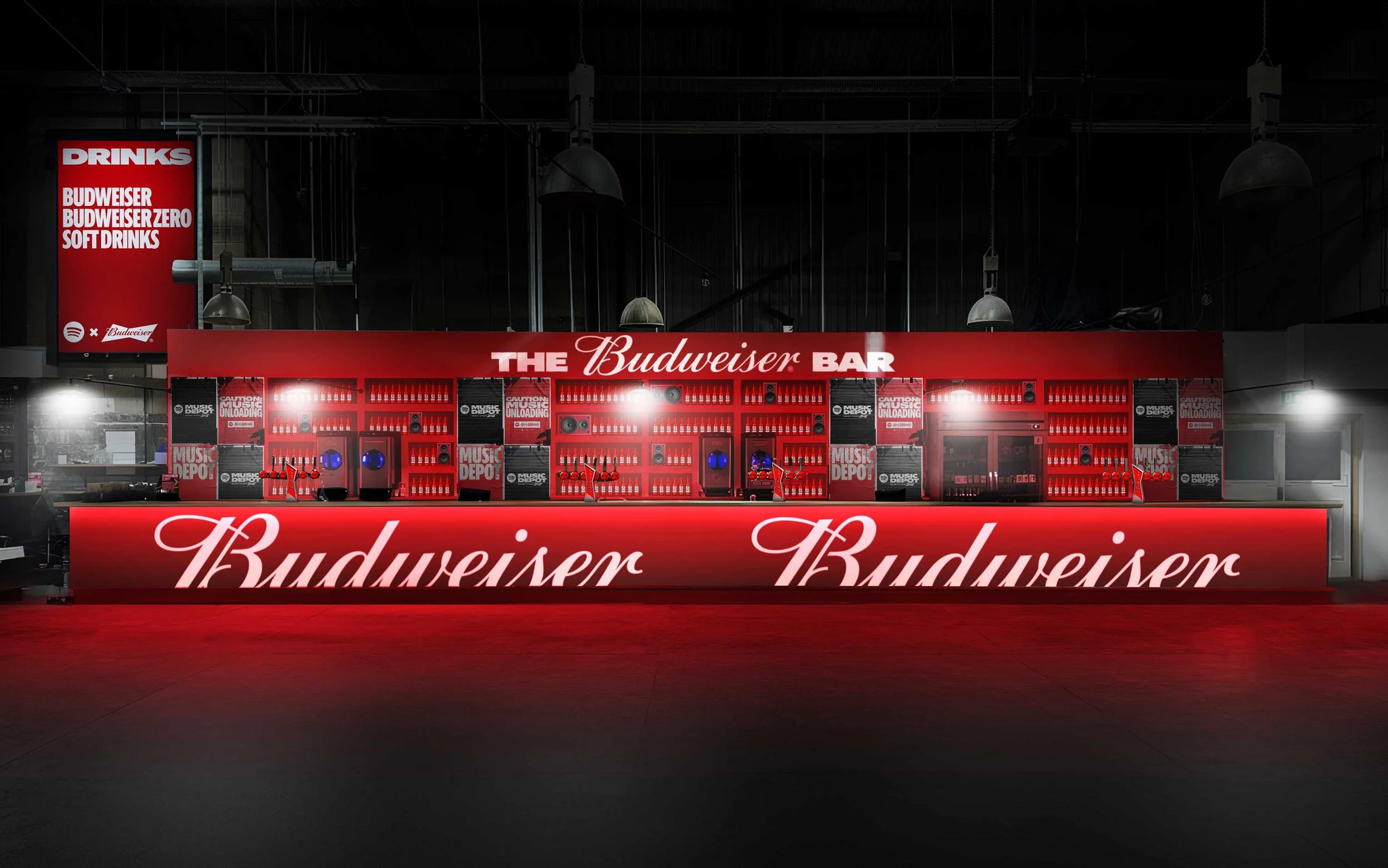
The early stages of the project focused on stakeholder alignment and spatial visualisation. Extensive in-situ mockups were developed to help align stakeholders around how the identity would function cohesively across the venue, from bars and merchandise areas to stage graphics and wayfinding.
Once approved, the system scaled across more than 200 print, digital, environmental, and experiential assets — maintaining consistency across performance, audience experience, and sponsor visibility.

“Major Keys adhere perfectly to brand guidelines but also really get under the skin of a brand personality to understand where they can flex the visual language to be more experimental and playful.”
Alice Smith
Senior Global Manager, Experiential Production
Spotify